April 24, 2023

This is a story about the Earth’s planetary orbit, an international airport in Palma de Mallorca, and the leading data-driven travel company Jayride.
I am Tzvi Harpaz—a data scientist at Jayride—and I would like to share how we use big data and analytics in the travel industry. But first, allow me to introduce the data at Jayride.
Jayride is a global travel marketplace for airport transfers where travelers find and book their rides worldwide. As such, we generate vast amounts of data daily.
Our data sources include (among others) bookings and quote requests from our customers and travel brand partners, transactional information from our payment gateway, Google Analytics data gathered from our website, etc.
These sources are the starting point of our data-driven decision-making journey. But the data is useless scattered across platforms in its raw form. So, we shape, clean, and polish raw data before organizing it in an orderly data warehouse. (We use GCP’s BigQuery for this purpose.)
Having everything in one place allows us to combine various sources and create powerful new ones for specific objectives. For example, combining our transport supplier’s performance data with booking information helps our support team to identify high-risk bookings and address potential issues before the travel date. This way, we keep our travelers and transport suppliers happy.
Our aim as a data-driven travel company is to enable every employee to make informed decisions. So, we create various reports in Tableau daily, including key metrics, supply and demand, SEO, SEM, and financial information. By providing access to our data in an understandable and easy-to-work-with format, we enable them to discover insights and base their decisions on facts.
As a travel company, knowing where our potential customers look for airport rides is crucial. We analyze demand data to provide an ample supply and competitive prices.
But being an industry leader means (in our case) that ours and our partners’ websites are regularly scraped by scripts or bots. Their role is to generate huge volumes of artificial quote requests that bury the real demand.
Thankfully, our data science tools allow us to counteract.
These bots have patterns—the majority include the source/destination location pair and the timestamp. Some scrape daily, others hourly, but they all use specific location lists. We feed these patterns to an unsupervised clustering algorithm, such as K-means, to identify and tag them as suspicious activities.
We manually created and tested a few simple logical rules using the underlying patterns and obtained the following results:
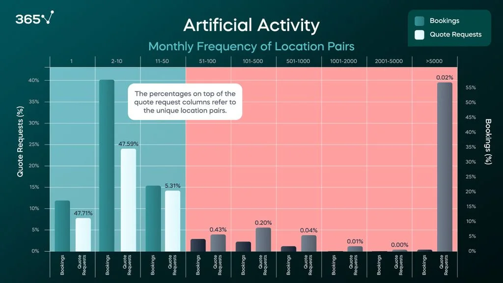
The rightmost bar shows that 0.02% of all unique source/destination location pairs generate 39% of all quote requests. Each one is quoted thousands (sometimes millions) of times per month but is responsible for only 0.4% of our bookings. This is clearly a bot activity.
By targeting and excluding the quote requests in the area highlighted in red, we exclude most bot-based quotes, which leaves us only with high-intent quote requests. This way, we can analyze the real demand.
We value our travelers and aim to understand their needs to satisfy them. Here’s how data science and analytics help us improve our travel services.
First, we gather feedback from travelers via our Net Promoter Score (NPS) forms and supplier reviews. The NPS form asks, “How likely are you to recommend Jayride to a friend or colleague from 1 to 10?” followed by a prompt to leave a review. We categorize those who choose 9–10 as “promoters,” 7–8 as “passives,” and 1–6 as “detractors.” We also send a form that allows travelers to review their transport suppliers and rate them with 1–5 stars.
We use numerical scores to understand customer satisfaction levels, which sometimes result in removing a poorly performing supplier from our lists. But numbers don’t tell the whole story. So, we combine the scores with customer reviews to get the full picture. Still, sifting through the volumes of free text information we receive and obtaining valuable insights from it is challenging.
Fortunately, Google’s amazing natural language processing (NLP) tool can do this task for us. To train the model, we went through thousands of reviews and labeled them manually—a labor-intensive and time-consuming process. But once the model was trained, it started doing the work for us.
Now, we can easily understand what satisfied customers like and address unsatisfied travelers’ dislikes. We can track changes in feedback over time and quickly identify and address issues.
For example, we thought most complaints would be about a driver not showing up but discovered they were about communication. After identifying this, we worked hard to improve communication and lower response and report-to-solution times. We hired more support personnel to respond to our ever-growing customer base’s demands. And our recent customer feedback shows that we’ve solved most communication issues.
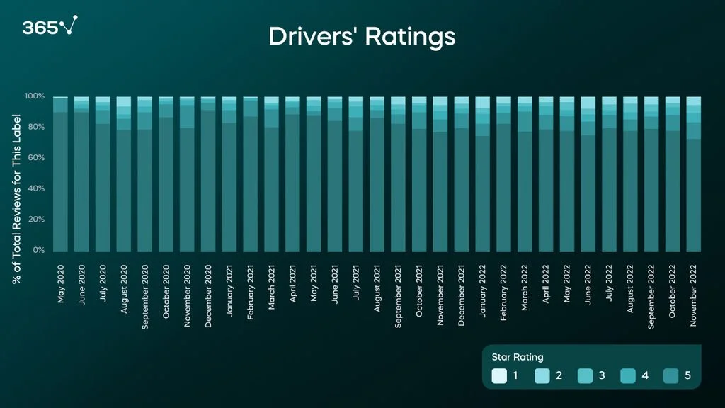
We haven’t neglected our drivers either, as they play a significant role in making our customers happy. The following is a sample of the changes in our drivers’ ratings over time.
Accurate forecasting is crucial for managing transport suppliers, prices, financial planning, etc. And since we couldn’t get our hands on a crystal ball, we had to develop other methods to forecast demand for our services.
We could rely on our data, but it is biased toward our business model. Every travel brand partner we add, every ad campaign we run, and every discount significantly change our demand hotspots. So, we introduced the external travel data provider OAG, which collects all global flight data from GDS bookings (Global Distribution System).
OAG provides the approximate number of travelers arriving at each airport monthly and where they come from. We calculate Jayride’s true market share, seasonality of airports, general growth trends in air travel, etc. based on this information. That’s how we improve our business operations and travel services through analytics and enhanced forecasting capabilities.
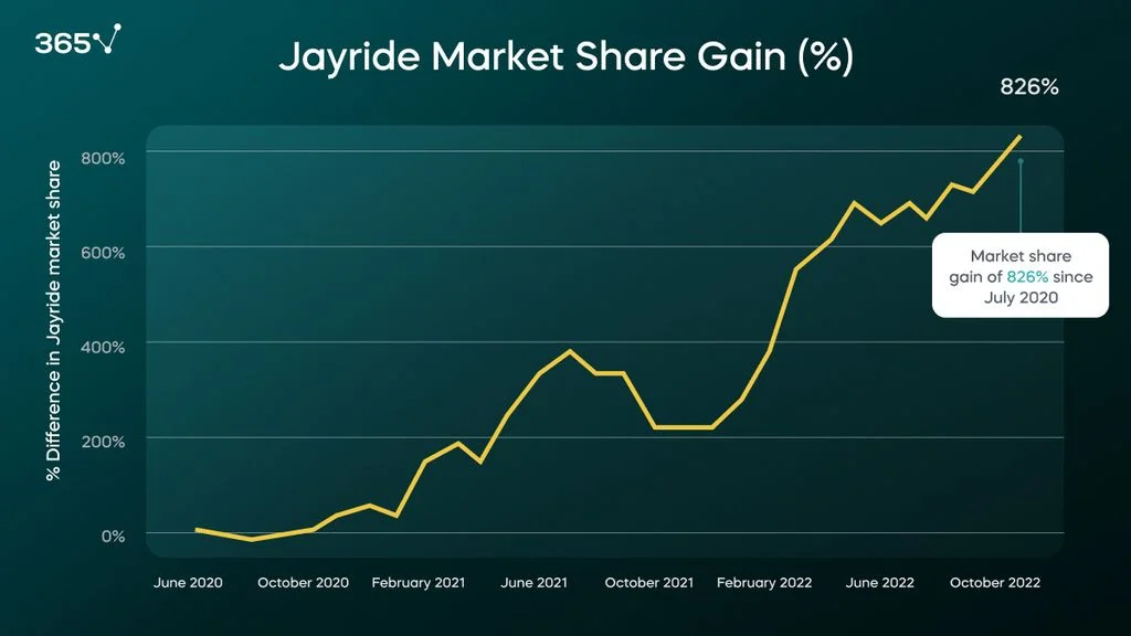
For example, we calculate market share by comparing the number of travelers who choose Jayride for their airport transfer to the total number of travelers arriving at that airport. Then, we chart changes in this relationship over time to see if we’re winning or losing share.
The following graph shows how we not only survived the travel industry’s downturn during COVID-19 but captured a much bigger slice of the market once travel resumed.
OAG data also allows us to anticipate seasonality in airport travel. This is more complex than tracking market share, as each airport has a different seasonality profile. Some have more travelers during the northern hemisphere summer. Others peak only in specific months (e.g., Florida airports during spring break). Yet others have almost no seasonality.
To understand these patterns, we divided the airports into groups according to the changes in volume they experience using the k-means algorithm. The following map presents some of our results.
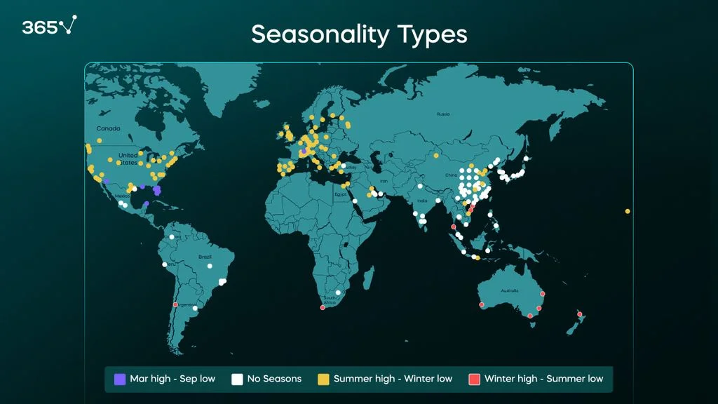
As you can see, Europe and the US (except Florida) have pronounced summer peaks and winter lows. Australasian destinations have a reversed pattern for southern hemisphere summer seasonality, while most airports in East Asia have low to no changes in volume.
This new understanding of the market helps us create more accurate forecasts.
We also developed an airport seasonality score to reflect the difference between peak and low volumes—the higher the number, the bigger the difference. The winner was Palma de Mallorca’s international airport with a whopping seasonality score of 4 (see the graph below). Palma de Mallorca is a popular summer vacation destination for European travelers, so this score isn’t surprising. Still, the fact that this airport has a more extreme summer seasonality than any other is an interesting observation.
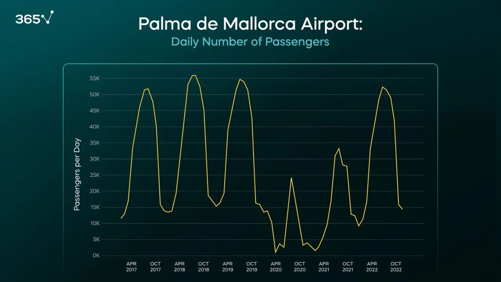
Forecasting is an excellent example of the usage of data science in the travel industry. For our forecasting, we developed a regression algorithm that takes as input each airport’s seasonality trends, our market share, the average airport transfer prices, expected global market growth, etc. It outputs predictions that can be broken down to an airport level and makes our forecasting more accurate than ever.
At Jayride, we value data-based decision-making. Our data flows to a GCP BigQuery data warehouse, and our teams access it in the form of Tableau reports. We use data science and machine learning to derive insights where humans lack the computing power to process large volumes of data. The stories I shared with you (battling unwanted artificial data, using a natural language processing model to understand our customers’ desires, and detecting seasonality patterns to better forecast future market behavior) are just three examples of the application of data science and analytics in the travel industry.
https://365datascience.com/trending/data-science-in-the-travel-industry-case-study/

September 18, 2024

September 11, 2024

September 04, 2024